NBME
The National Board of Medical Examiners (NBME) specializes in creating high-quality assessments and learning tools for medical students. They came to to Think Company in need of research and design to improve their online dashboard experience.
Background
The NBME team was comprised mainly of technologists (no designers!), but they created a dashboard prototype to test their choice of technology, Quicksight.
Our team consisted of a talented and multifaceted group of individuals: a content designer, a UX researcher, a tech lead, and a designer (That's me!)
Tools and resources
Figma
Airtable
Miro
Risks and challenges
Blue sky designing of such complex data within the limitations of Quicksight was very difficult, so there was the potential that we would create something that would be impossible for the client to implement.
Preliminary phase
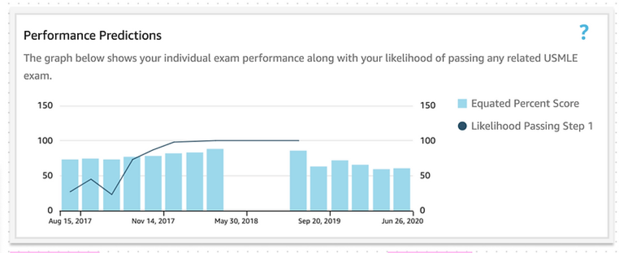
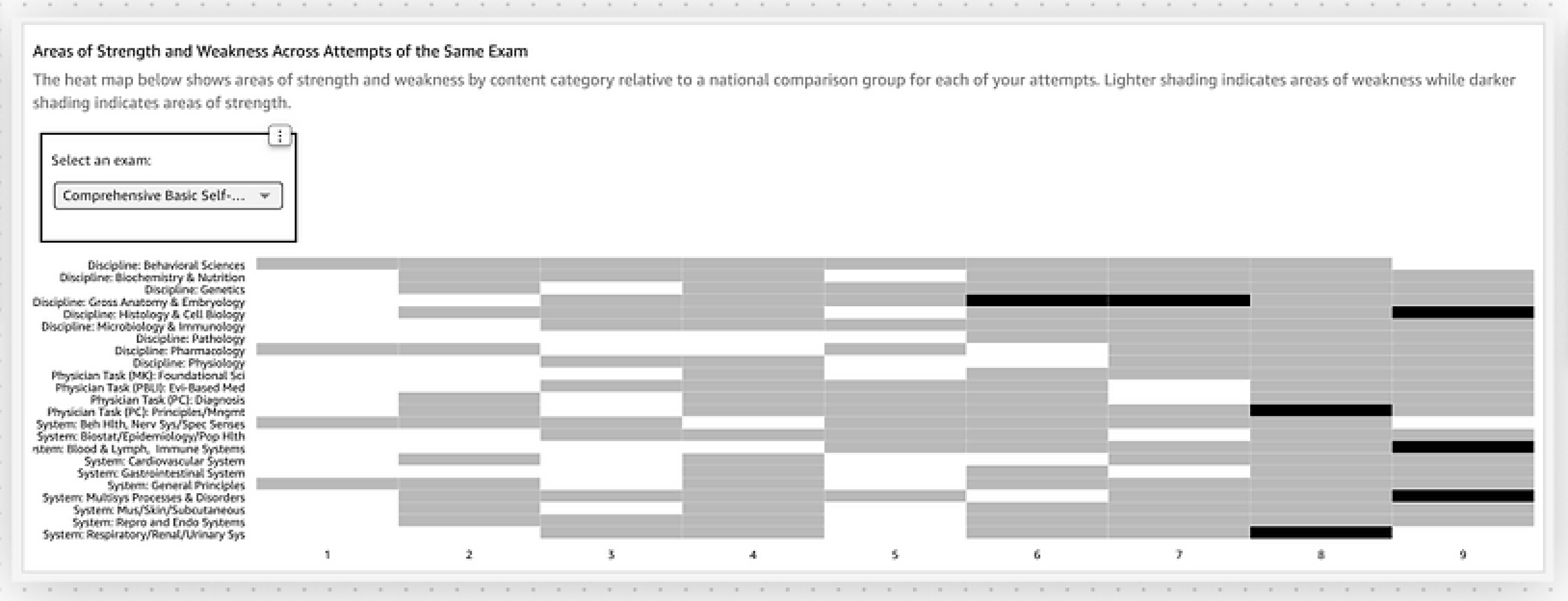
To gain insight into Quicksight’s capabilities, we met with stakeholders to evaluate the current dashboard and its respective data visualizations, as well as its functionality. Here are some images of pre-existing dashboard components.
Research
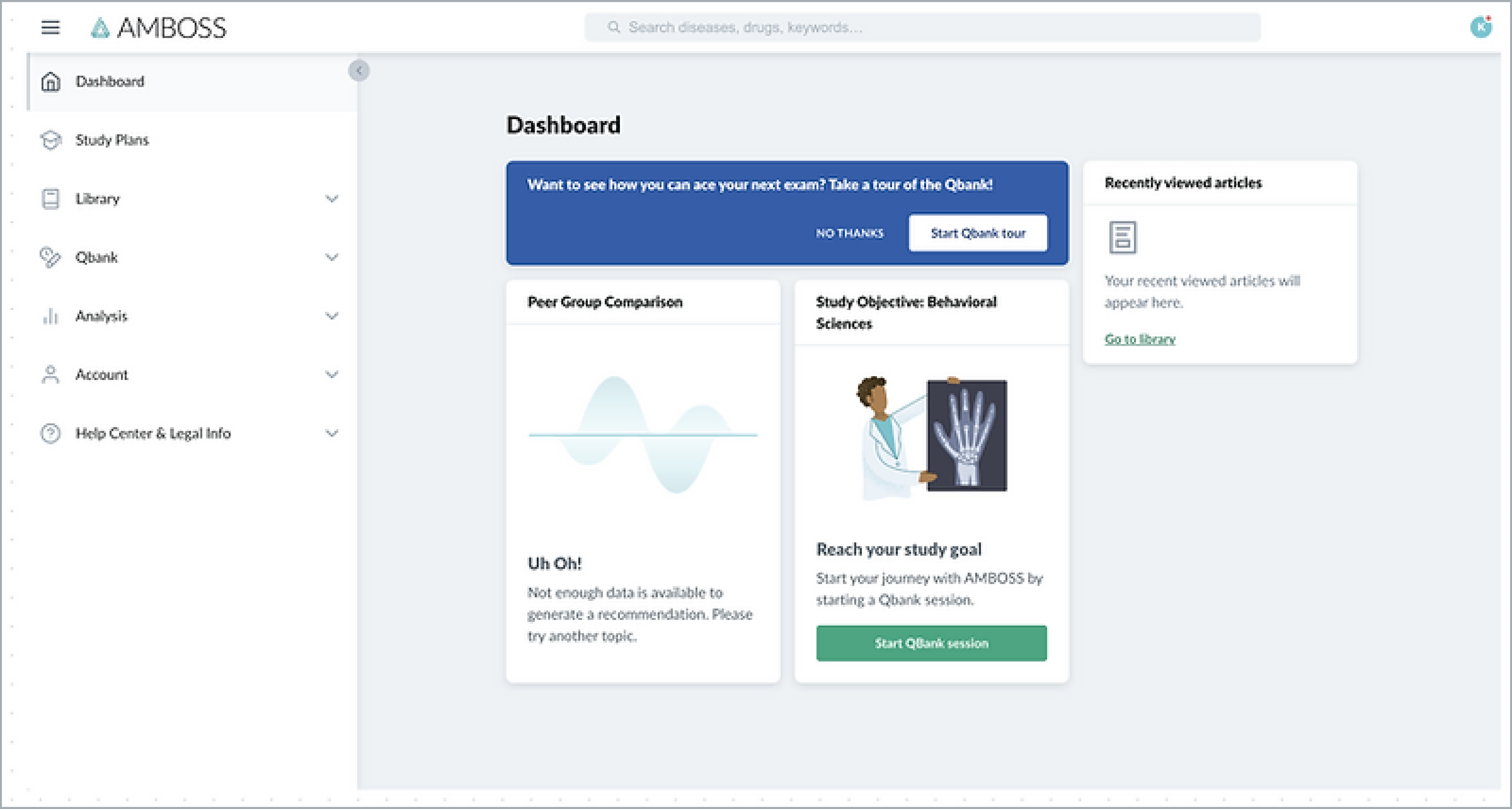
We conducted market research where we took a look at some of NBME's biggest competitors (UWorld and AMBOSS).
From here, we created a content inventory in Airtable where we granularly evaluated existing features and their functionality.
In-depth Interviews (IDIs)
Our goal was to identify pain points and to determine whether the overall content organization and interaction patterns made sense to users and addressed their needs.
Ultimately, we wanted to help medical students understand how they are performing on medical exams so they can become doctors.
“I need more context all around as to what things mean and what numbers represent.”
“More color would be helpful.”
“Every time I take a test, I like to look at trends.”
Tech discovery
We strongly recommended using a more suitable technology since Quicksight would not be able to employ a dashboard with the functionality, data visualization, and user-centered experience NBME had sought to accomplish.
Blue sky designing
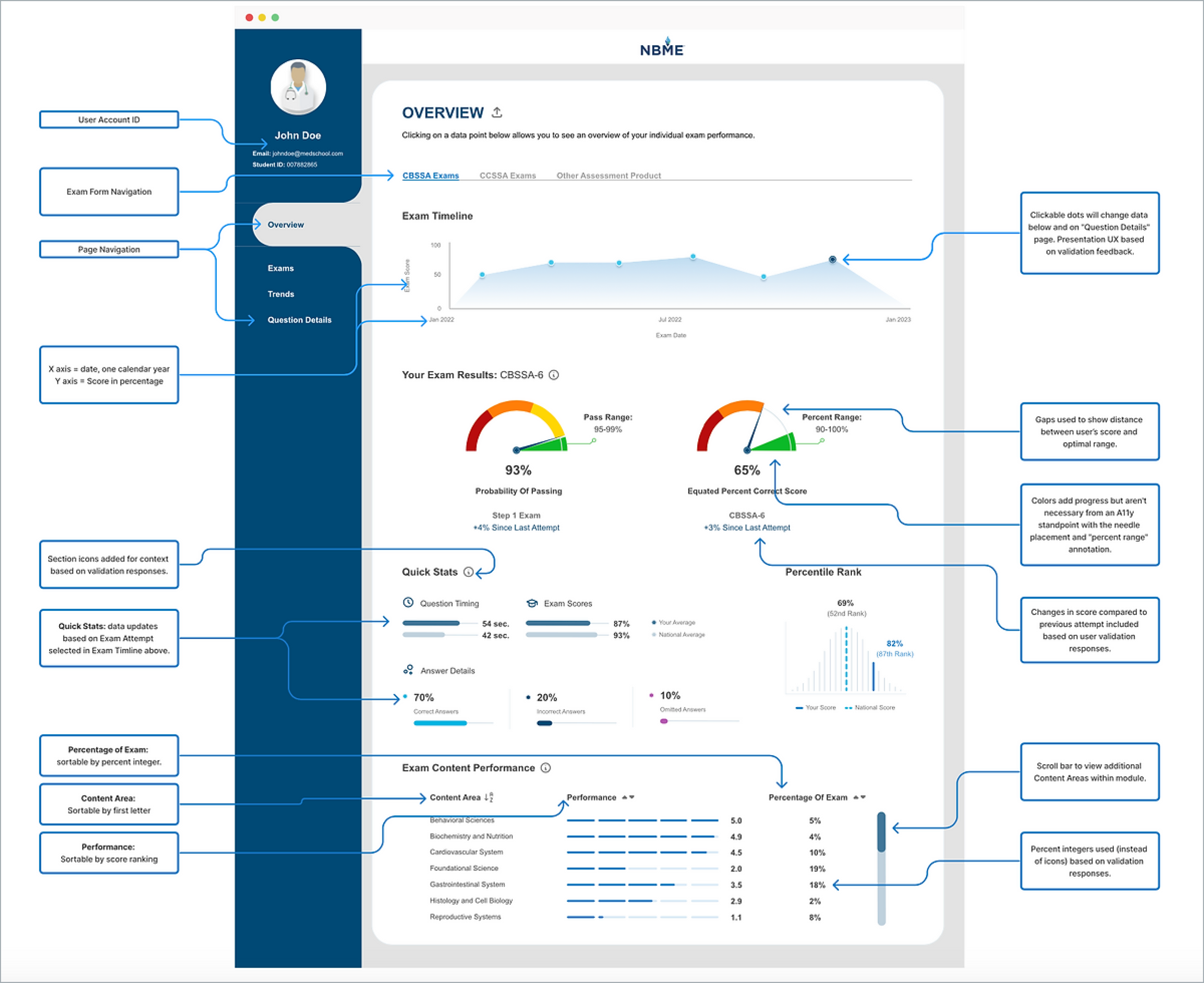
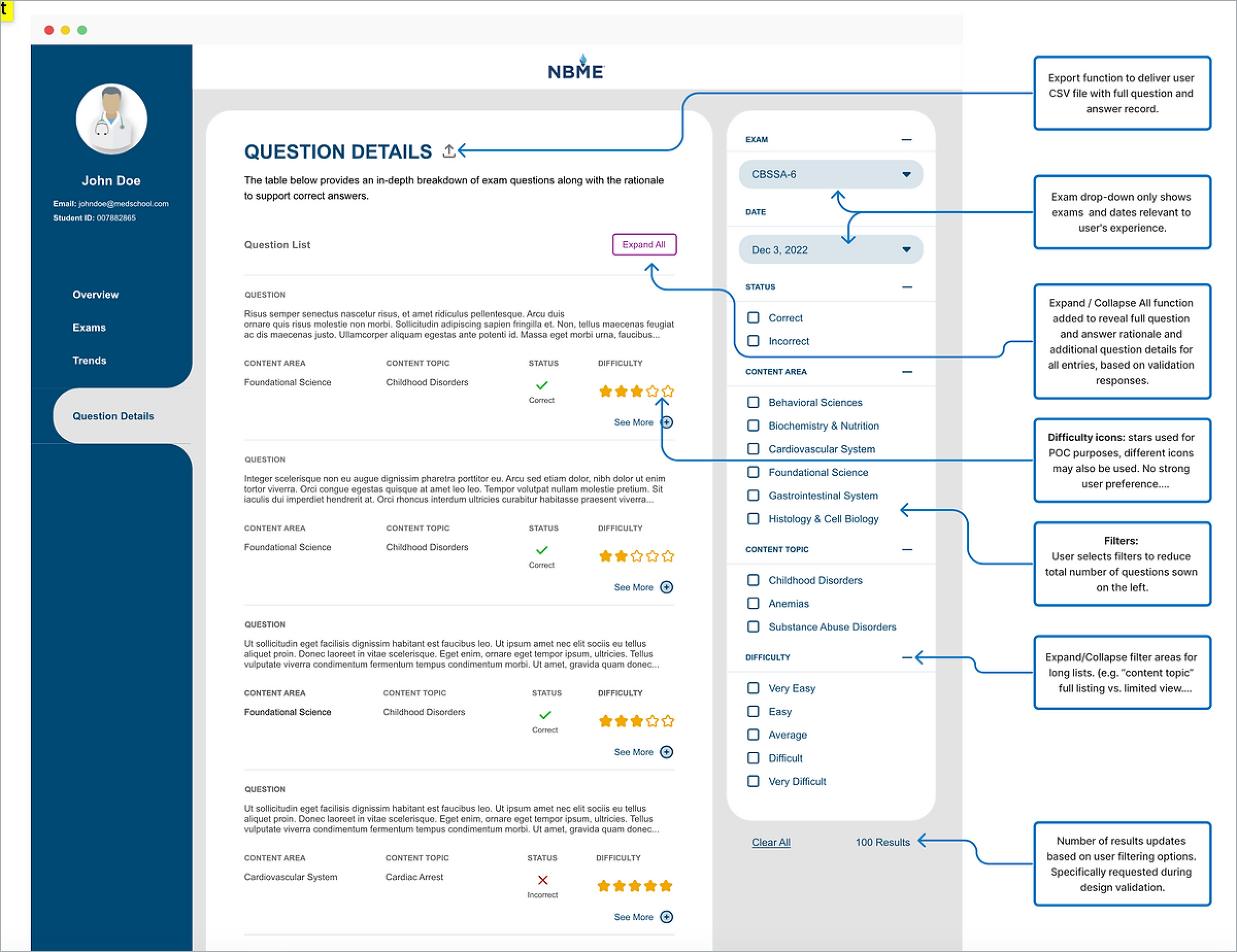
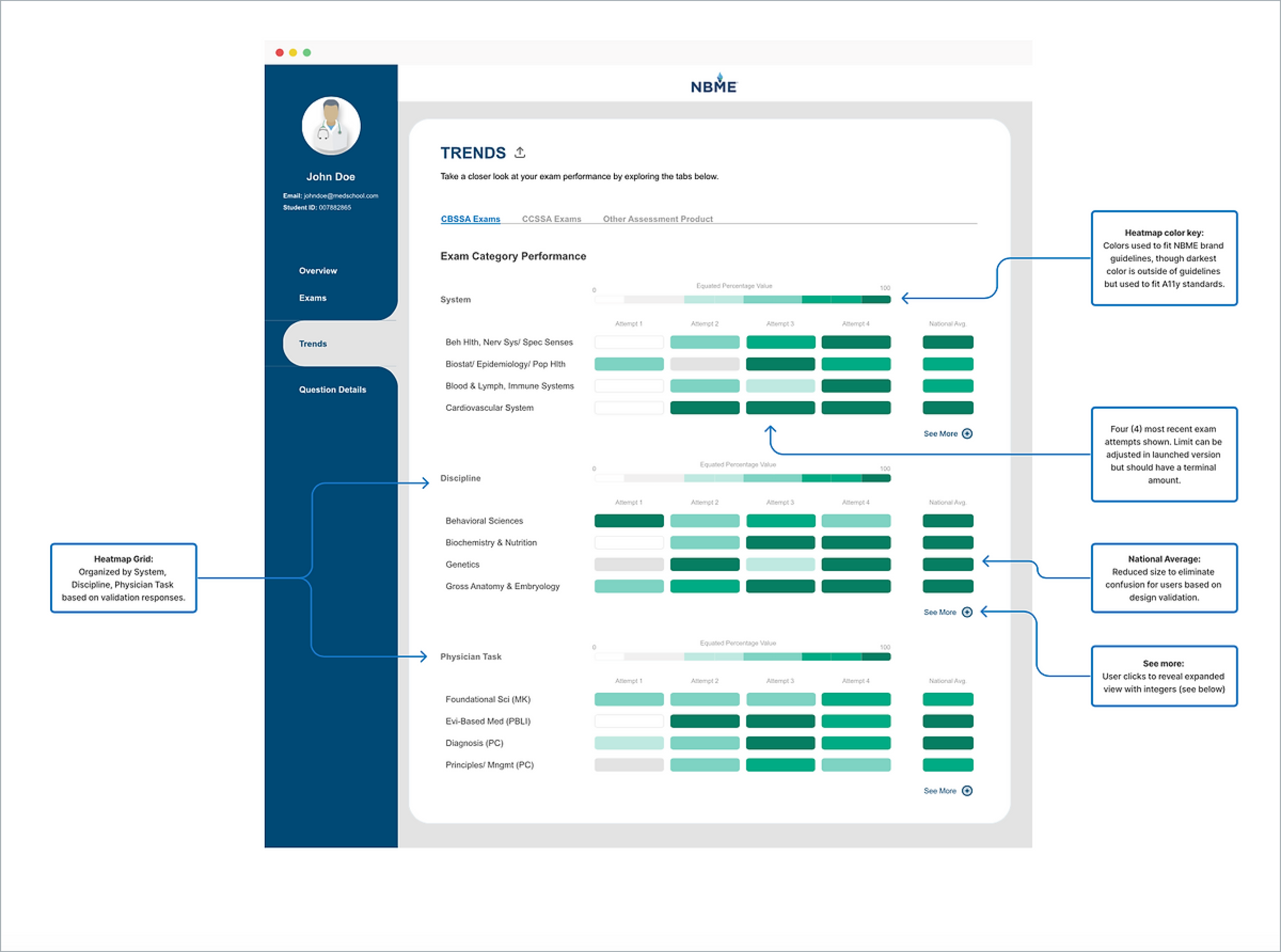
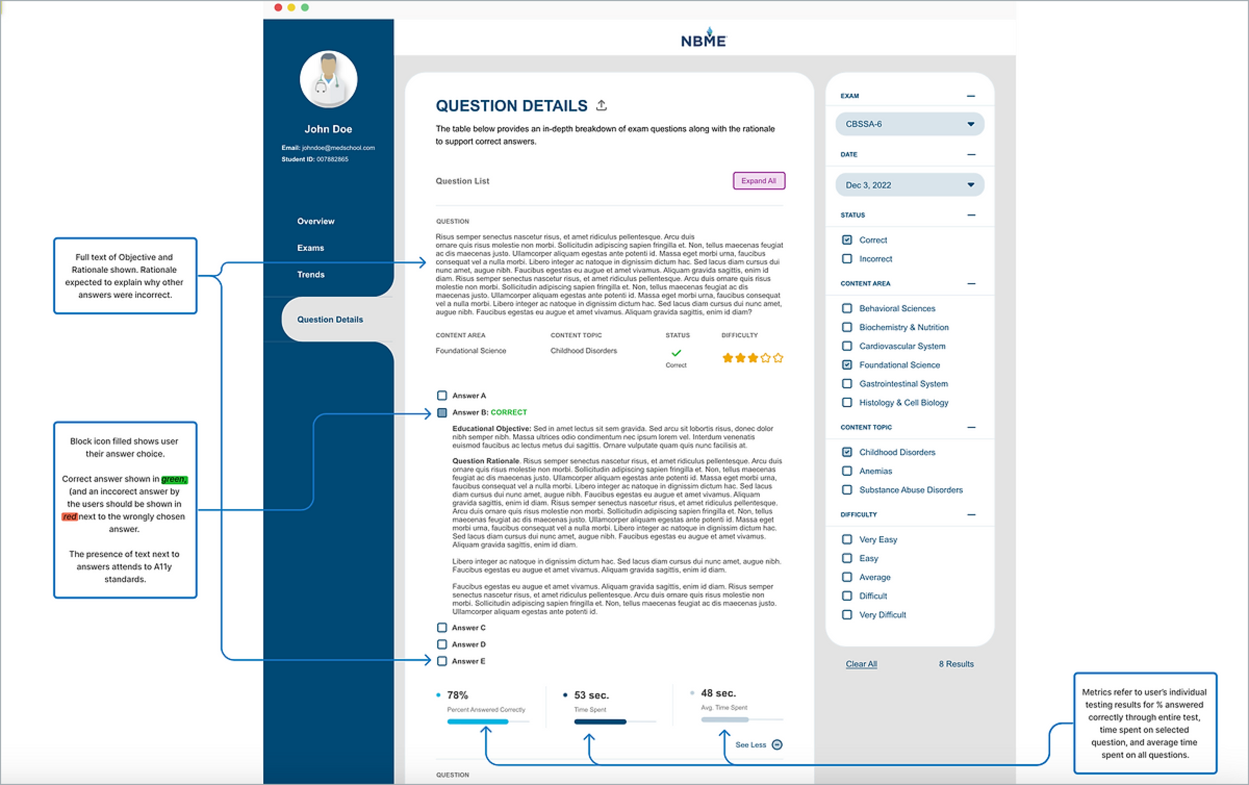
My team and I devised an updated information architecture for the proposed design that would speak more to user needs. I used research to inform my design process, and explored alternative options for data visualizations.
We used design validation to inform our design decisions and make future enhancements to the dashboard before delivering a final product to the client.
Users loved the use of color and were very receptive to new data visualizations. Overall, the content layout and structure aligned with their expectations. Though, we heard a desire for more explanatory content across pages and greater connectedness between pages.
“This is going to make such a difference, and I’m really excited about this.”
“This is exactly what I would want this to look like.”
“The colors and text and design are so much more friendly. This feels like a safe space.”
Future recommendations
Create an on-page navigation structure to allow users to jump directly to specific questions or exam sections
Add search functionality to allow users to search question details by keyword
Further break down content areas into distinct content topics


